

Team
1 Product Designer
1 Product Manager
1 Engineering Manager
6 Engineers
Skills
User research, product strategy, interaction design, information architecture, visual design
Tools
Figma, Miro
Time frame
8 months
It’s a pretty common problem with any software—the technology it’s built on has a ton of tech debt, is slowing teams down, and has reached a point that it needs to be rebuilt from scratch. With this, there’s often an assumption that the fastest way to unblock teams is for engineers to do a “one-to-one” rebuild—a redesign would inevitably take more time, right? In the case of Teachable’s curriculum builder, by redesigning the experience we were able to rebuild an entire Learning Management System (LMS) in 8 months while bringing new user value and solving years-old pain points all at the same time.
A vague downward directive
This project started with a vague ask: improve the course content editing experience to increase retention on our platform. Personally, I love a vague directive. Digging into user problems and guiding a development team’s direction is one of the most rewarding aspects of product design. The PM on my team and I ramped up a discovery period that included reviewing existing data such as metrics and zendesk tickets, analyzing our competitors, observing users on FullStory, and doing our own analysis of the current state. The existing LMS was 6+ years old and hadn’t seen any improvement for 2.5 years, so there were plenty of low hanging fruit that these scrappier forms of research allowed us to identify and start fixing immediately. We started fixing bugs, and I used best practices to design some small improvements to the editing experience.
Original curriculum builder
The original LMS had confusing and unlabeled icon buttons, inaccessible colors, and lacked affordance of how to navigate inside of a lesson.
Slightly improved builder
I used best practices to make slight improvement, by adding an explicit navigation action, updating the colors to have appropriate contrast, and moving less-used actions to an overflow menu
But even making small UX changes like labeling icons and adding affordance to the layout could take an entire 2-week sprint because it was coded in Angular 2, a language that literally was no longer supported. It was becoming quickly apparent that there were limits to what we could do to improve the existing tech.
Better understanding our users
While I had been at Teachable for 6+ months, this project was after a reorg that moved both myself and my PM partner from focusing on internal users to focusing on creators who use the Teachable platform. Because of this, we felt user interviews would be a good way to learn more about how users create content and the pain points with our platform, as well as just getting to know them better in general.
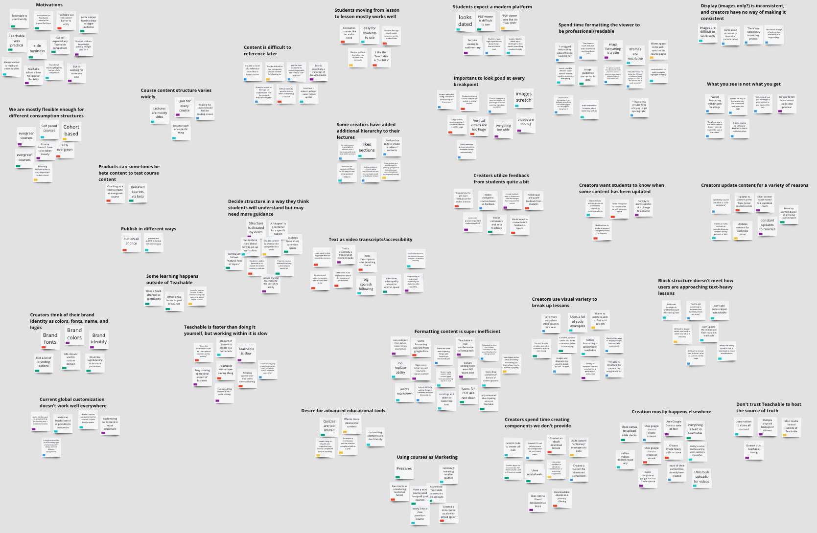
An affinity map of what we heard from creators during user interviews about their experience creating and editing learning content on our platform
We ramped up user interviews with those goals in mind, and learned quite a lot about our user’s needs, including some areas like the student experience which sadly were outside of our current focus. But the two main learnings that were important for this project were:
1. Our tooling is clunky and slows creators down
2. Our LMS has a high learning curve
Speeding things up, in multiple ways
So with all we discovered, and our early experience working to improve the experience in the existing tech, it was pretty clear everyone was being slowed down. Our creators were slowed by long loading times and a clunky and unintuitive interface and our product and engineering teams were slowed by outdated and difficult to update technology. Naturally we started talking about what it would look like to start fresh to speed things up for everyone.
When the conversation around a one-to-one rebuild came up, we started really analyzing how viable that would be. A reality of the current state was that the UX itself was built in such an inefficient way that a one-to-one rebuild would include those inefficiencies. One example is when creating a new “section”, users were brought to an entirely new page to enter a section name, save it, and then return to the entire curriculum view. Would it make sense to rebuild that?

The flow of clicking a button in the top right to create a new section only to be taken to a new page with just a single text input
Another example is in editing text, the existing state included two places where text could be edited: a full screen modal and an in-line text editing state. Would it make sense to rebuild both of those and continue to have two instances of the text editor to support?

In-line text editor

Full screen text editor
It became increasingly clear that the clunky existing state would take more time to build from scratch than a redesigned, more efficient one.
A future vision to drive decisions and excitement
So we knew we were building something new from scratch, but what could that look like? From our discovery period, there were a few clear pain points that I was set on solving in these new designs:
Navigating between individual lessons was a huge pain, and users often lose their place
Understanding how content displays to students was almost impossible
Inconsistencies in the interactions made the LMS difficult to learn and use
So I wanted to ease navigation, provide a more What You See Is What You Get (WYSIWYG) experience, and establish consistent patterns that would be easy for creators to learn and easy for development teams to build off of.
I started by sketching and then creating mid-fidelity mocks of what an ideal state of our LMS could look like. The goal here wasn’t to provide multiple ways to solve problems, but to provide a visual of what the future could look like if all the problems were solved. To keep this focused on user pain points, alongside each mock I also called out which pain point was being solved.


Mid-fi mock showing in-line curriculum actions
Mid-fi mock showing a WYSIWYG lesson editor
I presented this vision at an all-company meeting, and let’s just say the zoom chat was very hyped. Especially folks in our care org who have been guiding users through a clunky interface and providing workarounds for years-old bugs were invigorated that the company was finally investing in this space. This also helped get leadership excited and seeing the value in a longer-term project while in general the company was focused on projects with the shortest time to value.
Because this wasn’t exploring multiple ways to solve problems I next worked on some concepts around some specific areas to have discussions with the engineers in the pod around scope.
Concept 1 - In-line WYSIWYG editing
Concept 2 - Editing in modals
Concept 3 - Everything’s a form
We decided that the creating the outline of the course (we referred to this as the curriculum builder) and creating the actual lesson content would need to be on different pages due to the existing backend code. We also decided that a true WYSIWYG that felt like editing the student experience itself would add months to the project and not necessarily add a ton more user value, so instead decided to create an editing experience that still gave clear indicators of what to expect in the student experience without being a true WYSIWYG.
And with that, as our design lead I had driven clear decisions around scope and we were ready to start building this new LMS… once we had some actual designs at least.
Sequencing design work in phases
Our engineers would be wrapping up other work soon so I had less than a month to get some finalized designs for them to build. Redesigning an entire LMS in a month was completely unfeasible, and we didn’t want to fall into a waterfall approach anyway. Instead, I worked with the PM and Engineering Manager (EM) on our pod to determine a phased approach to the project. We decided the most efficient approach would be for me to first design the curriculum editor, then the base of our lesson editor including navigating between lessons, adding content, and the skeleton of what reusable patterns we would use for individual content blocks, and finally would design the experience for editing the different types of content in groups that we would build out.
With this plan we were kind of building the plane while flying it, but by at least considering the base of the page first I felt confident I wouldn’t be designing myself into a hole that I’d struggle to get out of.
Time to design some stuff
So, I started really designing! Throughout the project I designed multiple approaches and layouts to the part of the LMS I was currently focused on, get feedback from the rest of the design team as well as my cross-functional partners, and conduct usability testing on UserTesting.com to reduce risk of releasing something users didn’t understand or found difficult to use.
Curriculum editor
Design goals:
Move navigation and actions to places that user expect them to be based on behaviors we observed in FullStory
Improve hierarchy and affordance so the structure of the outline is clear and users understand what actions they’re taking
Speed up the process of creating a course outline by improving in-line creation and providing a simpler way to complete the most common bulk actions
Curriculum - Original
Curriculum - In progress
Curriculum - Final
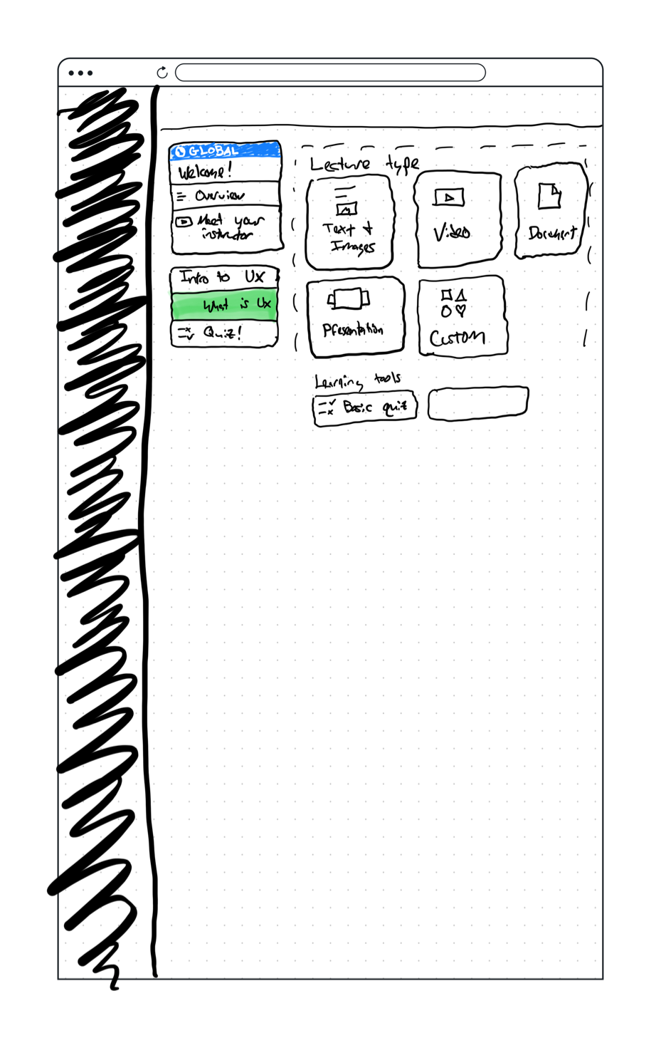
Lesson editor
Design goals:
Add more visibility into the types of content available, and create a flexible space for new content types to be added
Provide sibling navigation to easily jump between lessons
Have clear hierarchy for actions that affect the entire lesson vs individual blocks
Avoid hidden or hover actions to keep the UI intuitive and accessible
Provide visual previews of what blocks contain while avoiding using too much vertical space
Use consistent and scalable patterns for editing and modifying blocks
Lesson - Original
Lesson - In progress
Lesson - Final - Add content
Lesson - Final - With content
So, how’d we do?


Overall the new version of our LMS was well received, with creators excited about the new lesson navigation, how quickly they could build out and update their outline, and discovering all of the content types that were never clearly available before.
While we couldn’t immediately measure this project’s impact on retention, we looked at a few leading indicators to measure how we did.
We conducted CSATs on the original and new versions, moving from 69% satisfied to 82% satisfied
We measured the time it takes to publish a lesson and found an 84% decrease, so these were in fact being finished faster
And by updating the tech stack and designing a UI with reusable patterns that could scale with new projects, we unlocked ourselves and other pods at Teachable to bring new exciting features to the LMS. Prior to this project this core part of our product was untouched for 2.5 years, and after 8+ new features were built in only 6 months.
But it wasn’t all perfect
One thing we got wrong was being a bit too limiting by only allowing users to upload one file at a time, a design decision I made that removed some flexibility but sought to make the flow of uploading and managing file settings more clear and stymie users from adding too many videos to the same lesson. We learned that users were going to do this anyway, so we reverted that decision and allowed uploading multiple files at once.
We also had complaints from some users about tasks now taking “more clicks” to complete. I often struggle with this as a designer, we use tools like progressive disclosure and menus to help guide users through flows and not overwhelm them with information all at once, but it was true that in this new version some repetitive tasks now took a little longer. Ultimately I think we made the right decision in creating an interface that’s easier to learn for new users, but ideally would also consider power user usecases where we can get out of their way and let them complete tasks as quickly as possible.
In the end, we successfully released a gigantic project rebuilding a core piece of Teachable’s platform in only 8 months while bringing a ton of improved usability and functionality to our creators, which wasn’t even the primary goal of the project. Design doesn’t slow things down or act as a blocker, a simple and intuitive user experience is ultimately easier to build.