

Client
Homebuddy
Skills
Interaction design, user research, user testing, UX strategy
Tools
Axure, Sketch, Keynote
Time frame
3 weeks
Becoming a first-time homeowner is a difficult and sometimes overwhelming process and it doesn't end after moving in. Owning a home comes with a new set of responsibilities, the main one: maintaining it. It’s something everyone knows they should do, but most just don’t know where to start.
Homebuddy is a digital tool that simplifies home maintenance by creating an automatic home maintenance plan, giving timely reminders of maintenance needs, and supplying a kit of basic home maintenance tools. Ryan, the CEO and sole employee, was inspired to create this product after struggling with his own home maintenance as a first-time homeowner. We were tasked with taking an alpha version of this product and building a more user-centered version that helped homeowners manage home maintenance tasks and schedule time with professionals in a way that earns revenue for the product.
The current state
At kickoff, we learned what features came with Ryan’s alpha version and some clear areas it needed to improve. It included:
1. A basic layout for gathering information about a user’s home
2. A customized maintenance plan
3. A connection to maintenance professionals
Understanding our challenges
All projects come with challenges, and Homebuddy was no exception—especially for our short time-span. We were tasked with:
1. No solid revenue plan
Ryan had multiple ideas of how to monetize Homebuddy but hadn’t tested them with users. We knew we needed to explore these different options as we interviewed and tested users so we could strategize which were most likely to earn revenue.
2. No maintenance professional interface
The contractors that Homebuddy would partner with are not tech-savvy and designing a portal for them was not something our client wanted. This meant I needed to design a way to interface with these pros without designing an interface for them.
3. A distrust of reviews
Our client was someone who did not personally trust reviews, so we need to research how the majority of consumers feel about them to disprove this personal view and convince him that reviews are a valuable part of consumer products.
4. Lengthy onboarding
To create a personalized maintenance plan we needed to find the right balance of collecting enough information from users without creating an overwhelmingly long process so users would not abandon the flow during onboarding.
Starting our research

Initially, we focused on a broad topic—overall views on home maintenance—to help us understand the domain a bit better. We found a disconnect between how thorough homeowners thought they were with home maintenance and how thorough they actually were. 90% of homeowners think they are up-to-date on their home maintenance, yet only 40% do preventative care on their water heaters.
I wanted to understand how people learn to do home maintenance in the first place to prepare to incorporate educational elements in our design. Through this, I discovered that deciding between doing a project themselves or calling a professional was a unique factor to consider. I found it’s generally recommended homeowners avoid doing any work themselves that could risk serious damage to their home, or requires tools and skills that could put their physical wellbeing in danger. Also, while DIY can save money, the time a person spends doing it should be considered when measuring cost.

Next, we sought some quantitative data on how consumers view online reviews. We found that 85% of consumers trust online reviews as much as personal recommendations and while this may vary somewhat, it pointed us toward disproving our client’s assumptions about reviews.
Analyzing our competitors
While researching these broader subjects, we wanted to know what the competition was doing, so we analyzed a few direct competitors: HomeBinder, Porch, HomeZada, HomeSpot, and Dwellbeing. Ryan felt Homebuddy was unique because it assists users across an entire journey: from creating maintenance plans and managing maintenance tasks to providing DIY instructions and connecting them to professionals.
We found this was mostly correct; the majority of competitors don’t have a product that assisted users throughout this entire journey. However, we discovered a competitor that does all of this: Dwellbeing. We discussed this with Ryan and he decided to move the product forward without any major changes, however as we progressed in our design we knew we needed to include ways to differentiate the product through our design.
Additionally, I offered a strategy recommendation that he could differentiate his product by focusing his messaging on data privacy. Dwellbeing is connected with Liberty Mutual Insurance and likely collects the data on these homes as part of their business model. With increased consumer concerns with how digital products use their data, Homebuddy can be a more consumer-friendly option.
Understanding our users’ needs
When developing our user questions, we struggled initially with how to plan our questions for homeowners who don’t have experience with home maintenance; and it didn’t help that I had little-to-no experience with home maintenance myself. After speaking with our creative director, I realized we could include a line of questioning that involved tangential experiences like scheduling a professional from a cable company or assembling a piece of Ikea furniture. In the end, all of our users had experience with maintenance or repairs, but I was glad to develop this tactic to use in future research.
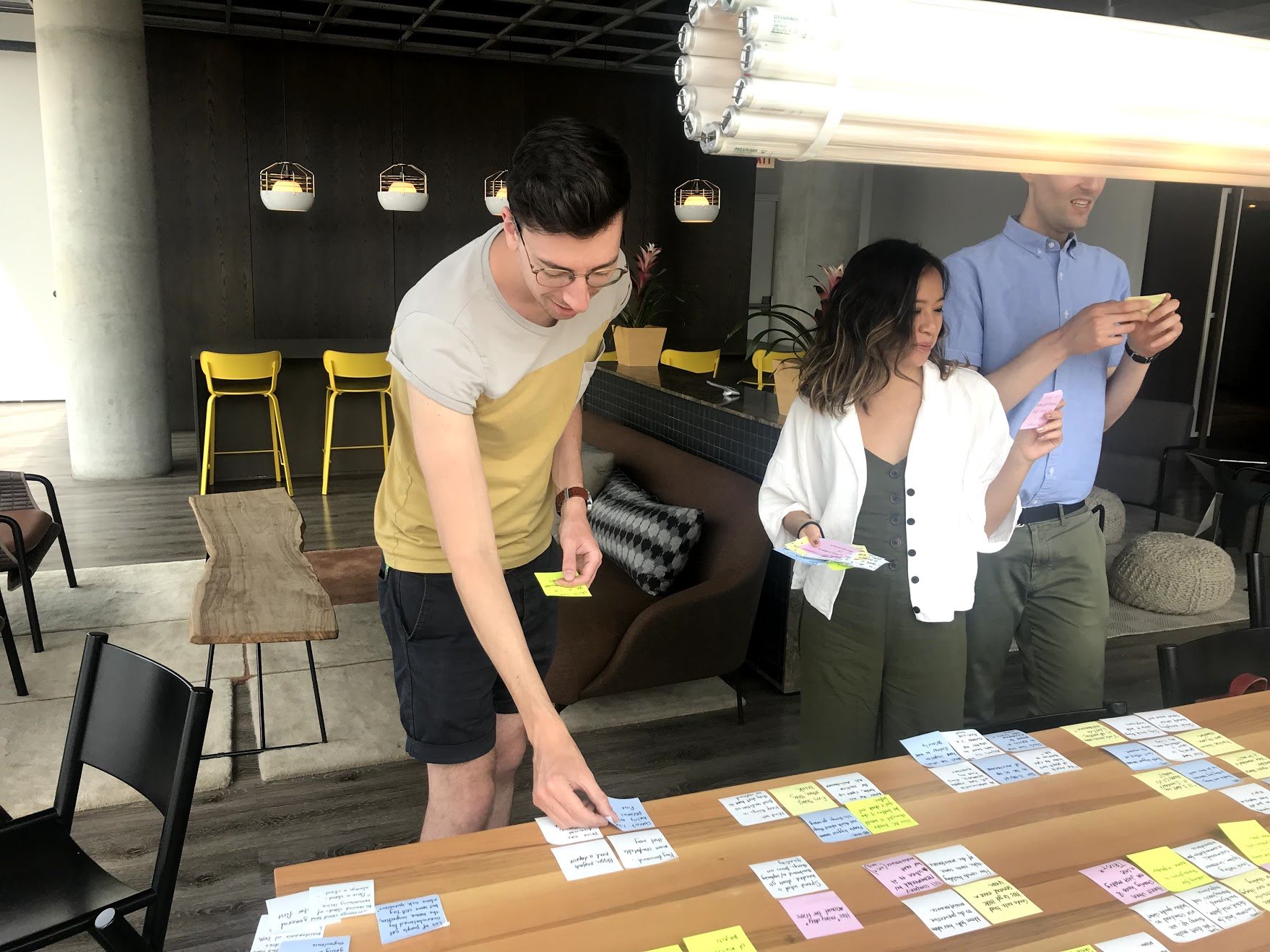
We mapped out data points to visualize trends we heard from users and to distinguish which were most important in guiding our scope.
Through these conversations I learned quite a bit about the ins-and-outs of home maintenance; and about the biggest problems our users faced:
“I only know when it’s not working.”
Users wait until something breaks before they learn about home maintenance
This meant we needed to focus our design to prioritize critical maintenance tasks that users may not know they need to do.
“When I tried to install something myself—having a clear understanding would have really helped me.”
Users start projects without knowing how to complete them
We realized we needed to prepare them with all of the steps required to complete a project so they wouldn’t discover they did something wrong halfway through.
“If you want to keep your marriage, hire someone else.”
Users often misjudged the difficulty of doing a home project themselves
This gave us direction to provide the time, tools, and skills a project requires to help users decide between doing it themselves or hiring a professional.
“User reviews are the biggest driver for me.”
Users trust and expect reviews
This confirmed our desk research on the topic. At this point, we felt we had enough research to insist reviews be an integrated part of Homebuddy’s design.
“When I bought my house I wanted to keep it in the best condition possible—but I had little-to-no experience with those things.”
Users are proud of the accomplishment of becoming a homeowner
From this, we realized we could incorporate design elements that emphasize these feelings of pride and accomplishment throughout our product to motivate users to care for their home.
Guiding our direction
After synthesizing this data, I wanted to explore our users’ journey in a journey map. I realized in past projects that user journeys are the best way for me to identify users’ biggest problems and the opportunities to intervene and change these behaviors. This also provided a tool to help our client build empathy with users as he was not speaking with them directly. I decided to map out a user’s journey from buying a home to learning about preventative maintenance.
Seeing this lowest point informed the ‘why’ behind our problem statement:
First-time homeowners need a streamlined guide on preventative maintenance that helps them effortlessly manage both professional and DIY projects so they can care for their home and avoid expensive repairs.
Initially, the problem statement was focused on a ‘comprehensive’ guide as that is what we felt our users indicated through user interviews, but our client was very determined to make something that was simple rather than comprehensive and incorporated only the basics of what a user would need. Because of this, we agreed a ‘streamlined’ guide would better fit his vision.
After identifying the problem we developed design principles to create alignment with our client of how we planned to move forward in designing this product. I struggled a bit with this because the principles we developed felt similar to my past projects. After speaking with our creative director, I felt more comfortable embracing similar themes and realized I could develop these principles by utilizing my previous knowledge and applying it to the challenges of this specific problem.

Every home is unique
Our design should take into consideration that every home and homeowner is one-of-a-kind by creating an experience that is tailored to their individual needs and level of comfort.

Out of sight, on your mind
Our design should understand that first-time homeowners don’t know the ins and outs of their home or the right questions to ask so we should anticipate their tasks and clearly explain what is required to keep their home healthy.

Leverage ownership
Our design will leverage the feeling of accomplishment new homeowners have, after making one of the biggest investments of their life, so they will take proactive steps towards caring for their home
When we presented these to Ryan, he reported feeling like they didn’t focus on the users he wanted to target. We realized the majority of our touch-points throughout this sprint were with users who were likely to be proactive about their home maintenance. Ryan wanted to target users who would take a hands-off approach and have maintenance done for them because they offered a better source of revenue by hiring professionals. To help us understand these two distinct user groups, we created proto-personas:
The process-focused homeowner
Proactive about their home maintenance
Confident in their ability to do projects on their own
Uses calendar software to manage tasks
Researches and compares when hiring professionals
The busy procrastinator
Overwhelmed by everything homeowning entails
Doesn’t know where to start with home maintenance
Takes a hands-off approach
Wants guidance and recommendations of professionals
Creating these proto-personas was very enlightening. I started to move away from using personas in my process because of potential stereotyping, so using proto-personas felt like the right balance of defining two distinct groups without making too many assumptions about who they are. This also helped us realize there are aspects of both groups in the users we interviewed so we could move forward confidently considering both types of users.
Ideating solutions

Now that we focused in on our problem and defined our users, we were ready to start developing solutions. We created user stories with the two proto-personas in mind and used them to focus our group brainstorming activities and individual sketching to develop three concepts:
The more you know
An education-focused solution that motivates users to do home maintenance by informing them of the value it provides and offers instructions on how to complete home maintenance tasks on their own.
We got this
A concierge service that makes home maintenance as simple and effortless as possible by creating a customized home maintenance task list and providing professional services that do the tasks for them.
Side by side
A comparison-focused solution that assists users in research and helps them make decisions on their own in a way that gives them control over their home maintenance.
We felt we got this and side by side were the best ways to further test if users wanted more control and more work, or less control and more automation in their home maintenance.
Finding inspiration
We sought out inspiration from products that did a great job of presenting interactions in their design that fit the concepts we envisioned. We decided to look to outside of just home maintenance and take inspiration from competitors who excelled in their own domains with designs and interactions that would be a good fit for our concepts.
Apple
Apple includes comparison pages which offer side-by-side breakdowns of different data points in an easily digestible way.
Medium
Medium has a minimal design which provides a large number of content articles in a way that isn’t overwhelming. They also set expectations for users by displaying the amount of time each article takes to read.
Asana
Asana approaches task management in a way that starts very simple but shows additional details as users interact with it.
Testing our ideas
Concept: The more you know
Concept: We got this
Concept: Side by side
We sketched out paper prototypes and tested these concepts with four users. Through testing, we found they were overwhelmingly drawn to the side by side concept—though all of the users we tested fell into our process-focused homeowner proto-persona. However, there were parts of each concept that tested well with users:
1. Helping users understand their highest-priority tasks
2. Providing simplified comparisons so they could make decisions
3. Offering different mediums of learning so they could choose which method to use
Converging our designs
To adequately meet the needs of both of our proto-personas and our client, we felt we needed to use pieces from all three concepts. We decided the best way to serve our process-focused homeowner was to keep the comparisons as a feature throughout the product, both when deciding which projects to tackle themselves and when selecting a professional to come to their home. Even though it was not a priority of Ryan’s, we wanted to keep educational materials in our solution because we heard from users that this created value for them and would motivate them to visit homebuddy in the first place. And to meet Ryan’s business needs and design for our busy procrastinator, we included four revenue options:
- An air filter subscription service
- A home maintenance orientation
- Purchasing materials and tools through affiliate links
- Hiring professionals through Homebuddy
As a team, we mapped out the site’s hierarchy to understand how users would navigate throughout the interface and decided to include four main areas:
- An onboarding flow that gathered information about user’s homes
- A dashboard with automatically generated tasks that expanded to show side-by-side comparisons of completing the tasks themselves or with a professional
- A secondary page of “home 101” where users could explore educational articles
- A flow for users to hire a professional
The side-by-side comparisons and hire a pro flow offered a way to differentiate from Dwellbeing by assisting users in making decisions for themselves and providing a list of maintenance professionals that fit the users’ availability.
I was tasked with designing the hire a pro flow. I needed a way to populate a list of maintenance professionals that fit a user’s availability without knowing exact time slots when the professional was available. I realized Ryan could gather general information on availability and created a flow based on this.
I also incorporated additional concept testing in this flow by providing five options with variable prices, a variable number of reviews, and ‘Homebuddy Certified’ badges. This would help us understand which factors were most important to users and whether Homebuddy Certified badges would influence their decision.
Testing our solution
We tested our digital prototype on four users and found we had a solid product that only necessitated small tweaks.
Onboarding
Overall users enjoyed its comprehensiveness and felt it wasn’t overly long. In fact, they wanted to input even more information. We felt this was going overboard so we proposed a future recommendation of including an optional flow to include more detailed information about the user’s home and appliances.
Dashboard
Users enjoyed the task list and the feeling of accomplishment they got from completing tasks. They also felt the side-by-side comparisons allowed them to do the research they would already do but without the additional effort. Users often skipped over the highlighted task and did not view it as part of the task list. Users also did not notice the home 101 navigation in the side navigation. We knew we needed to make a more cohesive task list and increase discoverability for the home 101 section.

When it came to UX strategy, we found an air filter subscription had strong competition. Most users already use Amazon for this specific service and it was difficult to compete with them on price and shipping speed. Users were, however, interested in the home maintenance orientation and hiring professionals directly through the product as long as they had choice and factors to compare who they would like to choose.
Hire a pro
While testing the hire a pro flow, users were confused by only being able to enter their general availability so I knew moving forward we needed to give users more granular options for entering their schedule. The conceptual testing of this flow gave us insights we felt were very useful for our client. Users were willing to pay $20 more for a professional who is Homebuddy Certified, as long as they had details as to which factors are used to certify them. We felt this was a potential way for him to earn additional revenue through hiring professionals or to get higher-quality and higher-priced professionals onboard.
One variable I failed to consider was the perceived gender of home maintenance professionals. I used a combination of traditionally male and female names and during testing, a user made a comment I interpreted as him viewing a woman as being less capable as a professional. While I still think it’s great to provide a representation of diversity whenever possible, in the future I will be more cognizant of how this can be a variable that may bias users.
DIY instructions
Users enjoyed that the Hire a pro CTA gave them an easy route to a professional if they found the task to be more difficult than they expected, and Ryan enjoyed that this pointed users toward revenue-earning options.
Finalizing our design
As we came to the end of our final sprint, we were ready to iterate our design based on the results of our usability testing. We focused on the interactions and content that were unclear to users.
Dashboard
Hire a pro
This final deliverable met and exceeded what we were tasked to do in our kickoff meeting. We created a flow that gathers enough home information from users without overwhelming them and causing them to abandon the flow, we created a task list that merges what Ryan envisioned with comparison information our users desired during interviews, created a streamlined process for users to find a professional without Ryan needing to call them personally, and throughout all of this kept business needs in mind to ensure our product would meet revenue goals.
Exploring mobile
While we felt that this product would work well as a native mobile application, it was not a feasible option with our client’s budget or skillset. After the completion of the project, I decided to explore how our designs could translate to a native Android application by using material design interaction patterns.
The tasks screen, with a banner calling the user to schedule a home orientation and an expandable list that displays DIY vs Pro comparisons.
The Home 101 screen, which incorporates filter chips and a search FAB so the user can find specific content.
The DIY article page, which translated from the web version without a need for many changes.
Step 1 of the Hire a Pro flow.
Step 2 of the Hire a Pro flow.
Step 3 of the Hire a Pro flow.
Planning for the future
We accomplished a lot in three weeks, but there was still plenty more to do. We wanted to make sure we prepared Ryan to continue to evolve his product so we provided a list of recommendations for him moving forward:
Short-term
- Test with busy procrastinators to validate that the product meets their needs
- Allow users to manage their tasks by snoozing and adding their own, something we wanted to implement but was not a priority within our time constraints
- Build a way for users to input more detailed information about their home and appliances after onboarding as they mentioned the desire for this during testing
Long-term
- Fully integrate with maintenance professionals so that users are able to select exact time-windows when scheduling an appointment
- Explore offering lawn care services. Most users mentioned this in user interviews as part of their home maintenance and scheduling these services is simpler as users do not need to be home during
We felt these strategy recommendations would help Homebuddy continue to grow and further define itself in the market. By continuing to develop features in the task list, fully integrating with professionals, and offering additional home services, Ryan can further differentiate from competitors like Dwellbeing.
Reflecting on the experience
Overall this was a successful partnership where my team and I were able to overcome challenges and use our design skills to strategize with business goals and create a product that helps users accomplish their goals.
We used UX strategy to balance stakeholder goals and what users wanted from the platform
We prioritized monetization goals by providing direct paths to hiring professionals while creating an interface that helped users decide if they could do a project themselves
We highlighted the option to purchase a home orientation on the main page
We identified that air filter subscriptions had a competitor in Amazon and it would be difficult to compete with them on price
I created a flow to schedule professionals without knowing their exact availability
I created a scalable solution to replace the current state of our client manually contacting professionals
I utilized as much information as our client could realistically gather and the desires of users to find a middle ground that makes the process as convenient as possible
We created an onboarding flow that collects a lot of information without overwhelming users
We balanced collecting enough information about our user’s homes without getting overly detailed
We recommended additional ways for our client to extend this information-gathering process after onboarding by including interactions for users to fully finish their home profile
We convinced our client of the value of reviews
We gathered data through desk research, user interviews, and concept testing to emphasize the need for reviews in a consumer-facing product
During this experience, I took the skills I developed over the last six months at Designation in research, synthesis, interaction design, and working with stakeholders and used them to building a digital interface that meets both user and business needs; I further solidified my process of analyzing user journeys throughout the process to keep their perspective and needs in mind; I continued to use my empathy skills both in understanding users and to work effectively with a team of fellow designers; and I realized I should see similarities with past projects as an opportunity to take what I learned from those experiences and adapt them to a new problem.
As my fifth Designation project, and third working with a client, I feel prepared to continue to use these skills and processes as a UX designer in the workforce and continue to learn new tactics and perspectives with each unique challenge and new problem to solve.