

Team
1 Product Designer
1 Product Manager
6 Engineers
Skills
Interaction design, information architecture, product strategy, visual design, illustration
Tools
Sketch, InVision
Time frame
4 months
Since joining Grubhub, I quickly became the SME on getting restaurants signed up for our platform. The initial MVP of our Restaurant Self-Onboarding (RSO) product launched in December of 2018. I joined the team as the launch was approaching and assisted in some of the final QA to ensure the product was working as expected. Now that it was live and being used by restaurants, I had a chance to take some ownership of the product and start iterating and making improvements both to the user experience and to the automation and scalability of our platform.
A reduction in leads
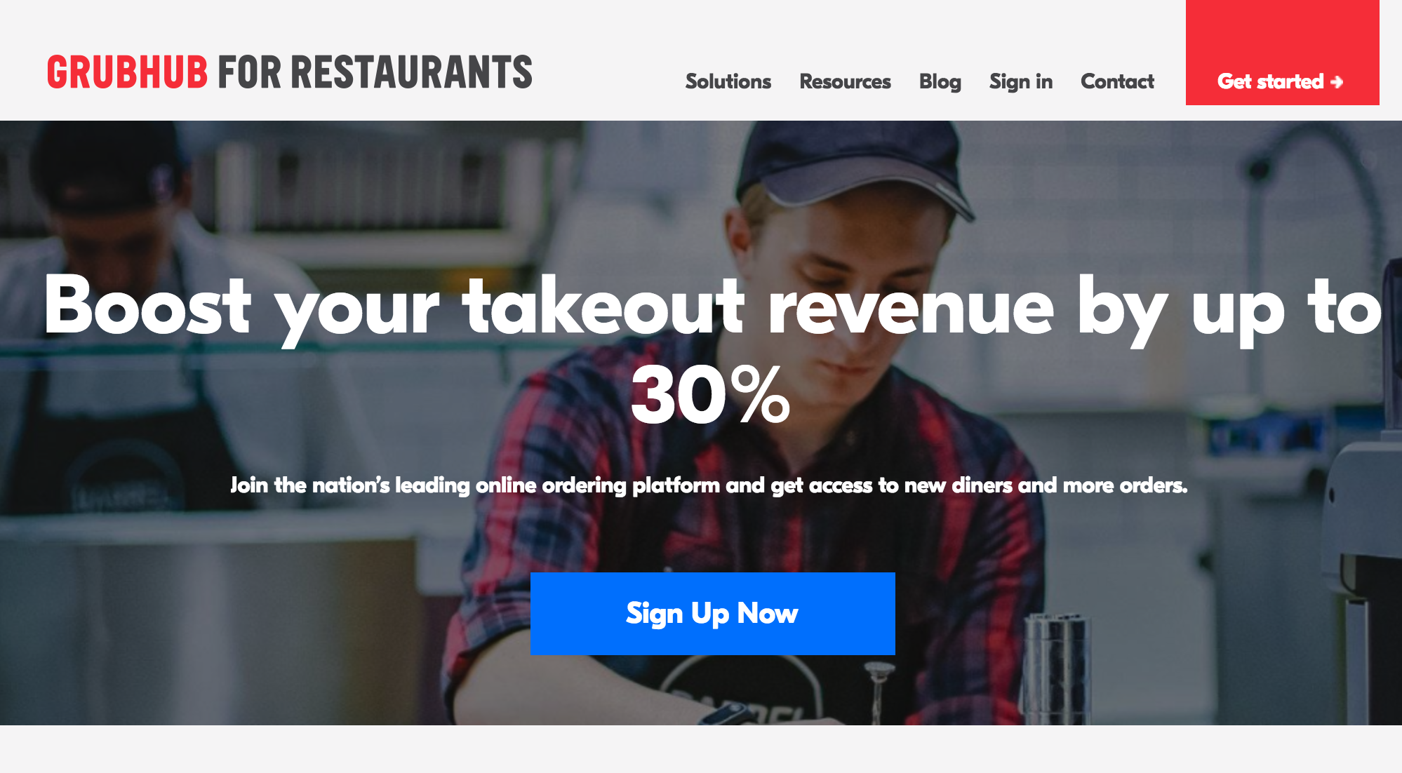
This project was sparked about 6 months after the initial release. Our Marketing partners realized a potential negative impact of changes made at launch was causing a reduction in the number of sales leads for restaurants interested in joining our platform. Before the launch of RSO, our primary B2B marketing site, get.grubhub.com, had input fields to gather leads from interested restaurants. Once it launched, that form was replaced with a single CTA to lead users to RSO where users had to input even more information before a lead was created. Our partners theorized that by returning the initial data gathering to the marketing site, we’d be able to return to the number of sales leads we had in the past.
Pre-launch marketing site

Wireframe of get.grubhub.com before RSO launch
Post-launch marketing site
Screenshot of get.grubhub.com after RSO launch
So, if we were going to return to having form inputs on the marketing site, it begged a question...
How might we make this handoff feel seamless and expected?
Beware the tweaks
I knew that at the beginning of this project my primary goal would be to design a smooth transition from the marketing site to RSO now that they would be part of a single journey. To begin, I sought to align with our partners on how their process could impact a cohesive experience.
They believed heavily in a/b testing small tweaks to their marketing site to assess its impact on conversion, an important form of data gathering for sure. But now that this was the first step of a user journey, I need to align with them on some guardrails so that we wouldn’t tweak to the point of changing a user’s expectation of what comes next.
“Learn more” user expectation

“Sign up now” user expectation
I scheduled a meeting to illustrate how different content on a CTA would impact how RSO should meet a user’s expectations. Gathering contact information and having an action like “Learn more”, a user would likely expect a confirmation that they would be contacted at the beginning of our flow, with sign up being an additional action they could choose to take. On the flip side, if the action is more clearly the beginning of a process like “Sign up now”, we could meet that expectation and get them directly into the process. Through this meeting we all aligned that a “sign up” action was the way to go, and that they could continue to use their process to identify the most effective CTA, staying within that overall concept of starting a signup flow.
Additionally, we agreed that I would partner with their web developer to align the data validation to better assist users in properly completing the form, and would provide some assistance in aligning the visual feel of both to feel consistent.
A new first step
Next, I wanted to focus on how this change would impact the overall user journey. Previously the marketing site was more of an entry point, but with this change it would instead become its own first step of the journey.
On a technical level, we aligned that the information a user enters on the marketing site would be passed to RSO and we could prefill the form there. By using this method, if a user made a mistake they would still be able to correct it before finishing the process. The problem, however, was that with the current organization of information those fields were not grouped, and this could create confusion about what the user still needed to complete.

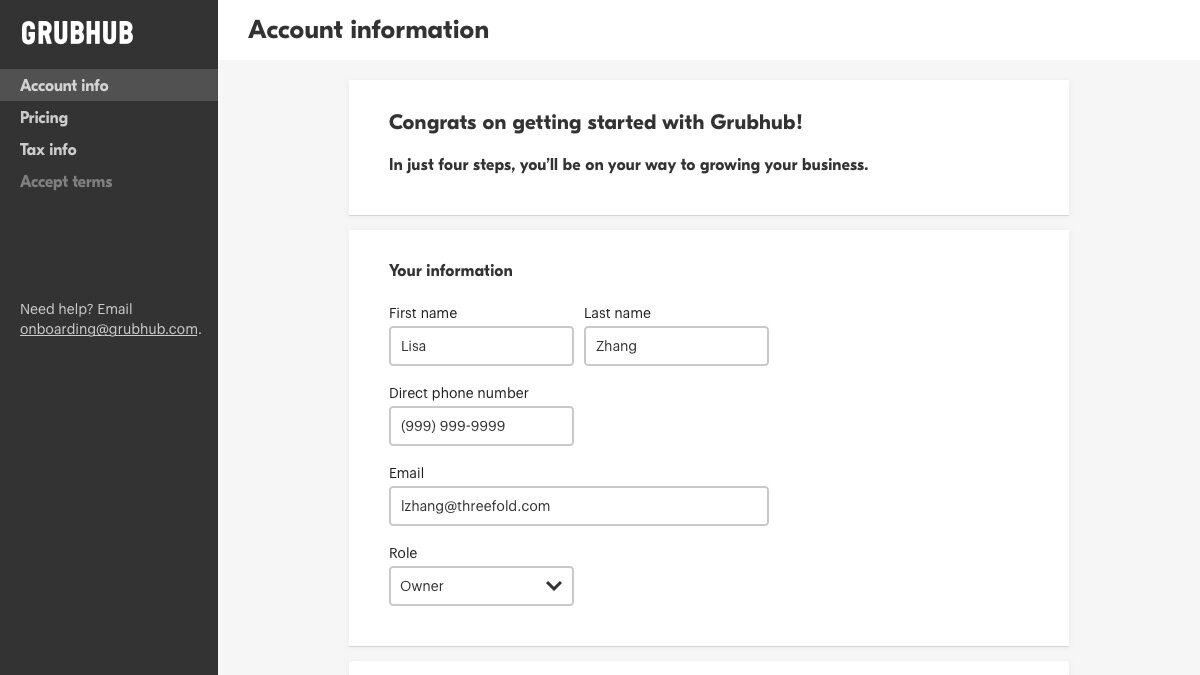
My solution was to take our rather lengthy “Account information” step and break it out into two steps: the first matching the majority of information entered on the marketing site and the second being what the user still needed to complete. This also allowed us to give the user some inherent progress, since we could now clearly show they’ve already completed the first step in the process.
Show me the progress
This inherent progress provided another opportunity. If we wanted a user to feel like they already made progress, we needed a way for that to become visually clear. The current navigation of RSO mimicked our main restaurant tool, Grubhub for Restaurants (GFR). It has a side navigation bar on desktop that collapses to a hamburger menu on mobile and tablet, and we were using the same pattern but with checkmarks to show progress.
There’s progress hiding in that hamburger, you just can’t see it.
Our RSO tool had 50% of users entering on mobile, and if we kept the same navigation pattern those users would have no sense of the progress they already made. To solve for this, I proposed instead using a progress tracker as our primary way of showing the steps that had been completed. This would better fit our needs on all breakpoints, and also allowed us to move some other information like how to contact care out of the hamburger menu.
We had an existing progress tracker, but I had concerns about accessibility and it indicating losing progress. As far as accessibility, it only used shades of green to denote progress, something that could be indiscernible for colorblind users. I worked to make small changes to this tracker, using both the size of elements and iconography, to update the component to still fit with our existing design system but be more accessible. For losing progress, this flow functioned a bit differently than previous uses because in the past, each step was dependent on the one before it; if you navigated back in the flow you would lose your progress. RSO was using wizard navigation but you could edit previous steps without losing the progress you’ve made. Because of this, I also created states that could show the progress you’ve made while indicating that you traveled back to a previous step.
Screenshot showing old progress tracker
Updated progress tracker, current step
Updated progress tracker, previous step
Prepare them for the journey
Another opportunity this presented was related to RSO no longer creating sales leads. Prior to this, there had been some hesitancy to be upfront about all the steps required for onboarding because it might “scare” users away. But in reality, we were currently messaging this process as four steps when it was really more like fourty.
“In just four steps”

The actual number of steps

My solution was to replace our welcome tile with an interstitial, this way it would be flexible enough to show to new users regardless of whether they began on the first step (there’s a small chance a user could organically reach this URL) or the second. I felt this could be an opportunity to welcome the user and set expectations by laying out the three main phases to our sign up and onboarding.
Illustrate the process
With this new interstitial, I also saw an opportunity to use illustration to both clearly represent the phases and add a bit of delight. I also had a personal goal of working on my illustration skills, so this seemed like the perfect opportunity.
We didn’t have specific illustration guidelines for our restaurant product, but we primarily used a greyscale palette and using blue to highlight a focal point of the illustration. Primarily our illustration library was almost icon-like, using representing an object, though we did have a product designer who started pushing that to include human characters as well.
Existing illustrations and inspiration
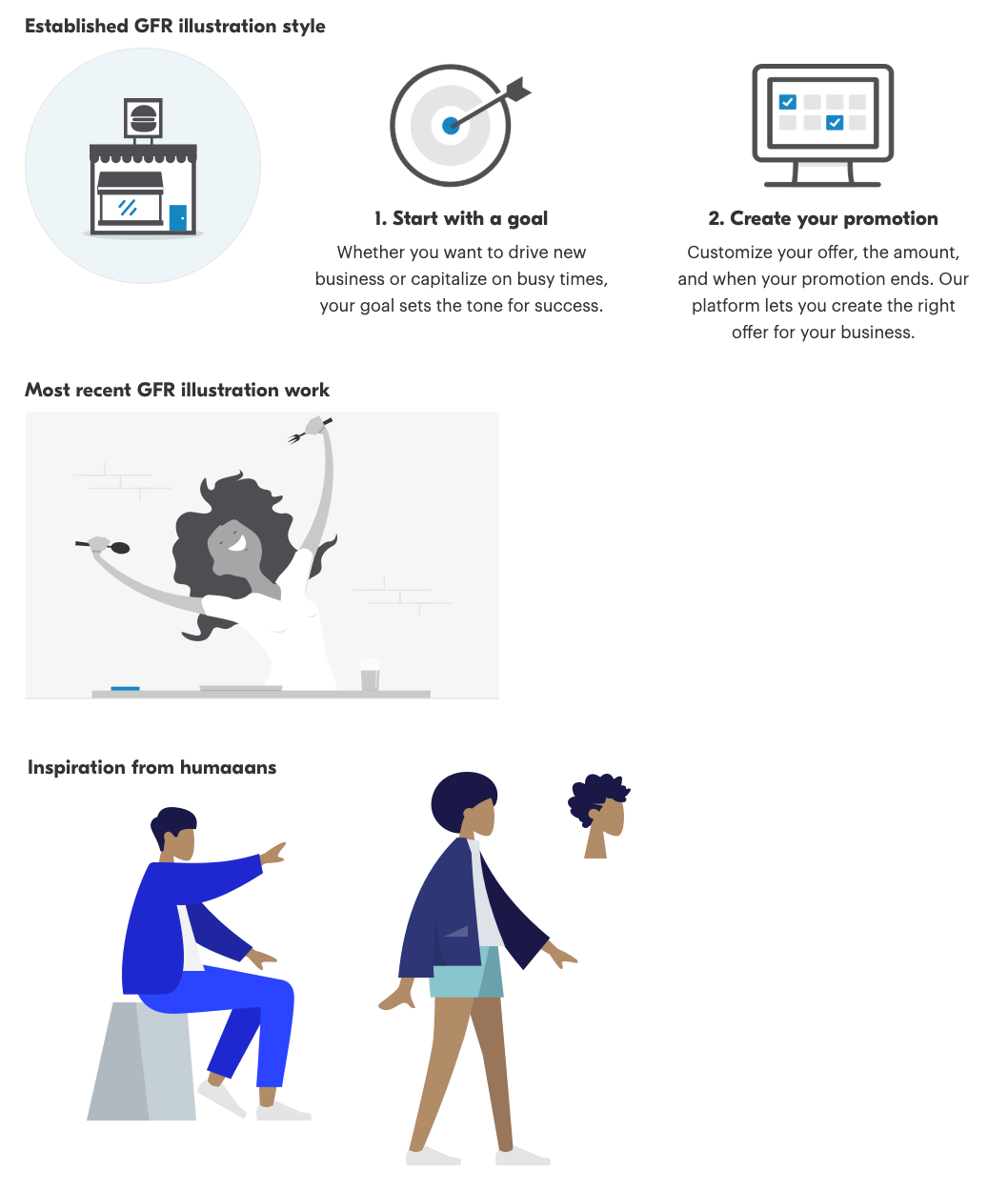
I explored a few concepts, some more object-focused and others action-focused with human characters. For the human characters, I took inspiration from the humaaans illustration library, both because the flat style already felt like a natural fit for our product, and because I loved their use of hairstyles that felt gender-neutral and inclusive of textured hairstyles, so anyone could see themselves in that character.
Illustration concepts

I aligned with the PM on these concepts and we decided to go the more action-oriented direction by illustrating scenes with characters. At this time, there was a fair amount of tension between Grubhub and restaurants, and we thought this could be a small way to make both parties feel a bit more human.
Also worked through evolving these illustrations with my design manager, who had a background in visual and graphic design. At one point I was exploring incorporating more color, because a critique of GFR in general is that it’s basically just white, grey, and blue. However, he gave great feedback that by taking it that direction but keeping grey characters, it started to evoke sadness. I decided to instead stick to our existing palette and really use the blue to create a focal point. Also with the help of the designer one desk over, I realized we could create a bit more whimsy with the second step and have our character “build” their restaurant rather than just sit in front of a computer.
Final illustrations

The result

Updated Marketing site

Welcome interstitial and illustrations
Inherent progress, progress tracker, and new second step
So, with all of these pieces of the puzzle coming together, the result was an updated experience that could meet our sales team’s needs by capturing leads earlier in the funnel, creating a bridge between our marketing site and RSO for a cohesive experience, better preparing our users for the process they were beginning through content and illustration, and using a new navigation schema to show progress that has been made.
I partnered with the engineers through QA and the update was released in September 2019. The overall data was promising, for the marketing site the new form converted at 1.76% compared to 0.90% with the previous iteration. And for RSO, the percentage of users completing the entire first phase increased from 11.3% to 18.8%, likely due to the changes in better setting expectations and showing progress throughout.
What I learned
Setting expectations didn’t scare users away
By using content and illustration to set clear expectations for what a user can expect in this end-to-end process, we didn’t scare users off and instead actually increased the number of users who completed the flow.
Fixing something that isn’t broken can still have a big impact
A lot of the changes I got included in the scope of this project weren’t fixing something that was broken, the product was perfectly usable. However UX improvements like showing progress and including some delight had a big impact on our metrics.
Illustration (and all of design) is a collaborative process
I had a bit of imposter syndrome working through the illustrations for this project, and that made me want to hide away my work until it was “ready” for others to see. But by rejecting that impulse and instead getting feedback while the illustrations were still not great, I ultimately was able to output something to be proud of.