

Team
1 Product Designer
1 Product Manager
6 Engineers
Skills
Interaction design, product strategy, illustration, visual design
Tools
Sketch, InVision
Time frame
6 months
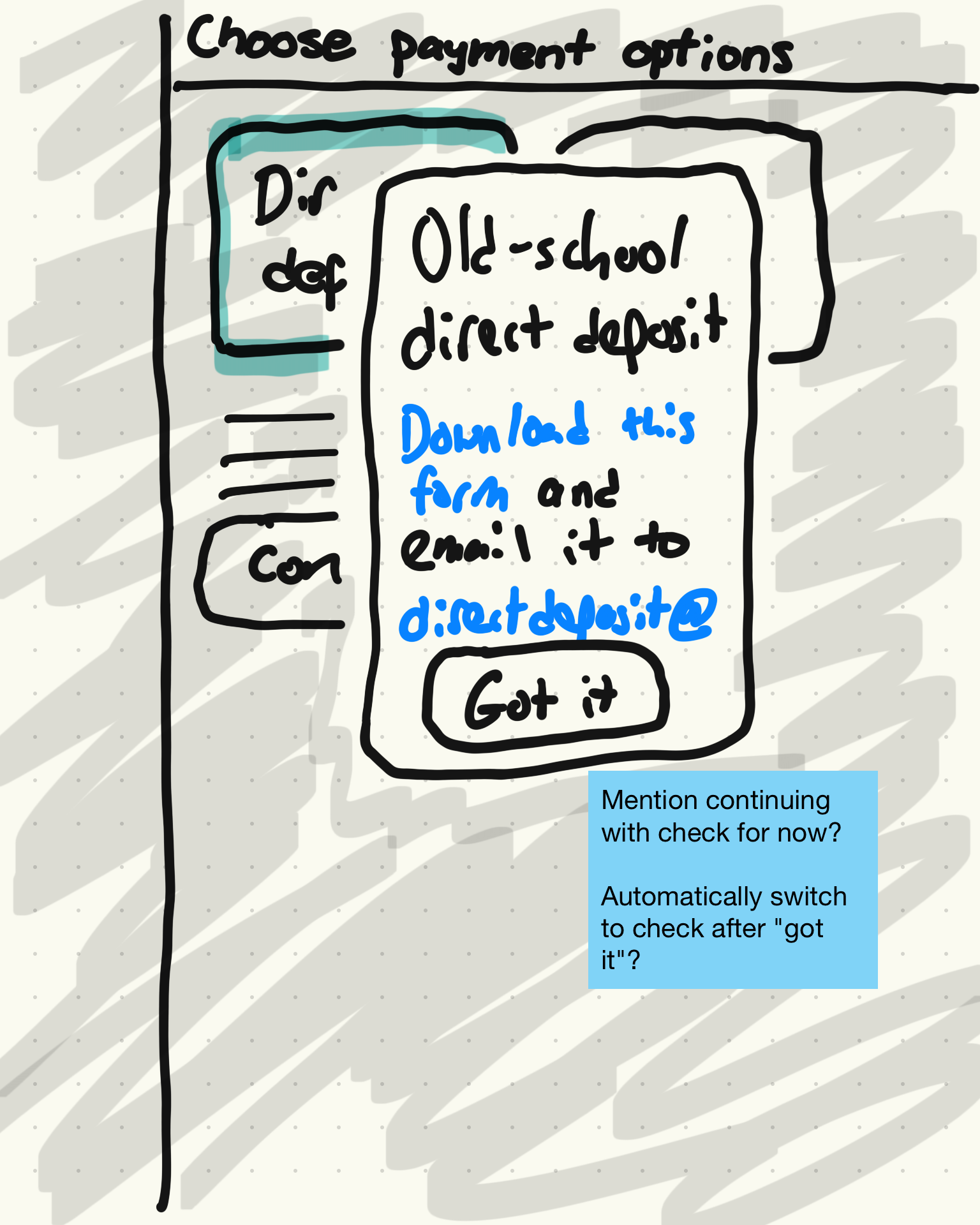
One of the most critical aspects to any marketplace product is making sure your B2B partners get paid. As of early 2019, a huge portion of restaurants using Grubhub were still being paid via a monthly mailed check, and those who were paid with direct deposit had to go through an antiquated process of downloading a form, voiding a check, scanning and emailing (or faxing) the two to an email address where two levels of care agents would input, review, and approve their information. In fact, the #1 contact for our Restaurant Care org was categorized as a “Payment Inquiry” which was a broad category but included contacts about setting up direct deposit and wondering when they are getting paid.
With our initial release of our Restaurant Self-Onboarding (RSO) tool, we were only supporting this antiquated method with a link to a .pdf on the thank you page. And this meant that with our new scalable signup process, for every restaurant that set up direct deposit a person in our care org still had to manually review and approve the request, quite an expensive process.
So the question was…
How might we make direct deposit digital and automated?
Strategizing for the MVP

To start, I worked with the Product Manager to focus in on what we should prioritize for the initial release. One area where I identified that we could simplify things is with our payment schedules. Grubhub had the ability to pay restaurants daily, weekly, bi-weekly, fortnightly (One major learning of this project was what “fortnightly” meant). When reviewing the data we learned that the vast majority of restaurants were on weekly payment schedules, so if this fit their needs it made sense to just default users to weekly which simplified both the design and technical implementation.
Another issue was that the original brief saw “managing” how a user is paid as part of this effort. This was related to users being able to change their direct deposit account once they’re a live restaurant on the platform and using our Grubhub for Restaurants product (GFR). While I agreed with this being an important effort, it was a single bullet in the brief that greatly increased the scope. Setting something up versus being able to manage it are very different actions from a UX perspective, so working with Product we agreed to separate that into its own effort so the action of managing would get a proper amount of focus.
We also decided to go with a 3rd party integration via Plaid to process the bank account information. I didn’t realize this at the time, but integrating with a 3rd party would bring its own challenges for the project.
Concept and simplify the flow
At this point RSO had already been out in the world for a few months, and there was an established pattern of how users navigate through the second phase of the process and between steps. My first challenge was around how to structure a multi-step process within a single step of onboarding.
Concept 1 - Equal options

Concept 2 - Prioritize direct deposit

First, I explored and got feedback from our design team and other stakeholders on if we should treat direct deposit as a default, or have users choose between direct deposit and mailed checks. There were larger factors that impacted this decision, some business stakeholders felt that monthly checks benefit the business more as that meant funds were in our accounts for longer. We also had some other usability issues around users not seeing the “optional” tag in self-onboarding, so giving the options an equal weight could allow for clearer usability and expectations for how to move forward in the flow. While I did think there was value in highlighting direct deposit for our users (something most restaurants expect and prefer) ultimately we went with the equal approach.
With that decision made, I was able to start exploring a user flow for how we’d lead a user through this process, including communicating some fairly complicated requirements around “matching” the bank account holder name with their business name to prevent fraud.

Flow v1
We went through a few iterations of this flow, largely impacted by new learnings around what Plaid, our chosen 3rd party tool, was capable of. Originally we thought that for banks that would not instantly confirm the account, we would need a path where users could verify micro-deposits to confirm the connection. We later learned that this was not available within the Identity portion of the product that was necessary in order to match account holder names. In the end we had a much more focused plan that simplified the project.

Flow v3
The trouble with identity
While this change did simplify the flow a bit, it also added a new factor to consider. With the Identity tool there were far fewer banks available to choose from, so how would we help users who couldn’t find their bank move forward in the onboarding phase? I realized that we could likely assume if someone opened Plaid but closed the modal without choosing a bank, it may be because they couldn’t find theirs. So I sketched out a flow of how we could dynamically ask users if they’re having trouble, only when it’s contextual. And for better or worse, if their bank wasn’t available in Plaid, leading them to our antiquated options was the next best thing.

Step 1

Step 2

Step 3
Step 4
Communicate the status
I also needed to work through how we communicate to users the different states of approval. One learning we had through user testing in the Photos step of RSO was that users were often confused or frustrated by “Pending” or “In Review” statuses. Since we didn’t want a pending status to keep a user from finishing the phase, I decided to instead frame it as a “soft approval”.
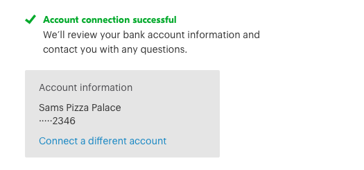
Regardless of approved or pending, the user would see an “approved” state, but for pending users additional text would explain that we may reach out with questions. We felt pretty confident that even pending approvals were a close enough match that after human review they would still be approved. The real question that I didn’t push on enough was if that meant we were being too cautious and these should just be automatically approved in the first place.

Approved state
Pending state

Rejected state
A bit of delight
I do my best to always incorporate bits of delight in my designs. Psychological principles point to it being easier for users to make decisions when the emotional part of their brain is activated, so even a small bit of fun can help facilitate that.
We had an existing pattern of using larger blue tiles for when we needed radio buttons with a strong visual presence. As a part of this effort I created new illustrations to represent the choice between direct deposit and a mailed check, and included subtle animations in their hover states to add a bit of delight.

Illustrations by Jonathan Corvin-Blackburn
Another aspect of delight came from a super not delightful 10 second loading time. It wasn’t until late in the project that I learned that Plaid could take that long to send account and identity information back to our platform. For that long of a wait, a simple spinner could have users refreshing the page thinking something was broken. Because of this, I decided to design an animated loading state that blocked interaction on the rest of the page.
For the development effort to be worthwhile, I wanted this to be an animation that could be used anywhere in GFR. I explored a few ways to animate related to restaurants and ultimately went with the idea of order tickets moving down the line. This was paired with content that explains what is happening and provides assurance that the transfer of information is occurring

Animation by Jonathan Corvin-Blackburn
The result


In August 2019 we released a product that digitized direct deposit setup, increased scale by reducing manual effort for internal employees, and created an interface that guides users through a flow with some less than ideal unhappy paths. I was able to turn a project with pretty strict constraints due to fraud prevention and 3rd party integrations and output a friendly user experience that doesn’t reveal the complexity of its backend to our users. I wasn’t able to get clear information on how big of an impact we had, though I was able to find that after its release, the percentage of care calls that were payment inquiries continued a steady declined each month.

What I learned
Investigate 3rd party integration impacts
This was my first time integrating a 3rd party tool into a product, and because of that I learned some things later in the project that ideally would have been identified during discovery. The complexity of checking for identity and the long load times are both things that I couldn’t prevent, but moving forward I’ve learned the questions to ask to ensure I’m planning for this sort of 3rd party friction earlier in my process.
Challenge constraints that burden users
If I were to revisit this project, I’d push back a bit harder on some of the legacy assumptions around fraud prevention and being paid via a mailed check being equal. Ultimately that complicated the experience and resulted in fewer users being able to successfully use the product.
Turn long load times into delight
From this project I learned that there may be some things that I can’t change, but that shouldn’t stop me from at least trying to make the experience the best it can be. If something like a 10-second load time can’t be avoided, I’ll know moving forward to do what I can to either make that happen asynchronously, or at least give something for the user to enjoy while they wait.